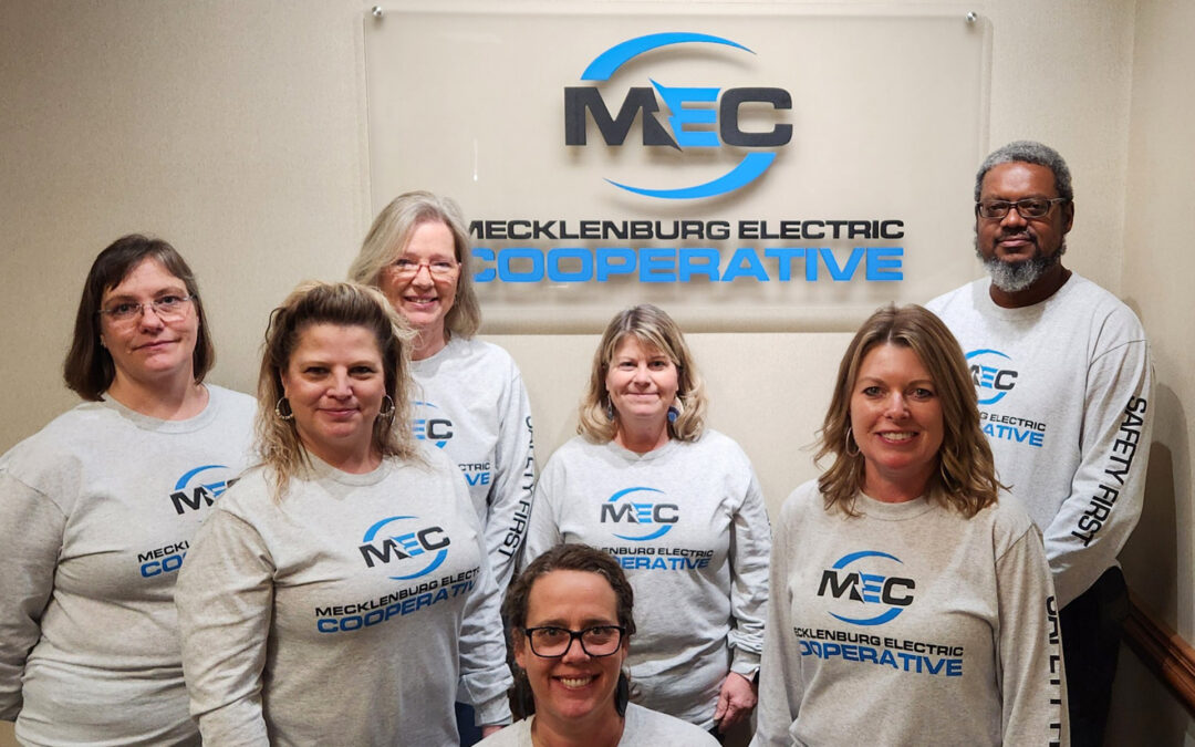
Mecklenburg Electric Cooperative is proud to announce that it has implemented a brand refresh, consisting of a redesigned website and a new logo. The updated website was launched Dec. 29, and offers streamlined menus, clear navigation, and a responsive layout for all platforms. It was crafted to be faster, easier to navigate, and more user-friendly. The new logo, refreshed with a new font and a blue-and-black color scheme, incorporates a modern, open feel.
The primary objectives for the changes were a focus on ADA compliance, aesthetics, and content simplification.
Priscilla Whirley, MEC manager of communications and marketing, offered some insight into the changes, stating, “We’ve discussed transitioning for a while now but were apprehensive about making the change. As we began making plans to redesign our website, we discovered that the red, green and yellow colors used in our former logo, which has been in use for over 60 years, were hard to distinguish between for people with sight disabilities, and also triggering for those on the autism spectrum. Many of our Members conduct their business online now, and it is imperative that we do everything we can to serve those with disabilities as well. This was our impetus to take the plunge.
“The blue and black color palette used in the new logo is ADA compliant and stands for what we represent. Blue sends a message of trustworthiness, dependability, and strength, while black conveys power and stability,” she said. “As we start the new year with a new look, we are still the same cooperative our Members have come to know and trust.”
MEC will be implementing the use of the new logo in phases over the coming months. Members can expect to see a gradual rollout of all branded materials, like signage, vehicle graphics, uniforms, billheads, plus much more. This project will take time, so it is possible that you might see both the former and current logo around for a while.
“Our former logo was iconic — widely known and acknowledged — has represented the service excellence that MEC has been known for the last 50-plus years,” said MEC President and CEO John Lee.
“We are where we are today because we’ve had the ability to look toward the future and anticipate change, growing and adapting into what our Members and our communities need. Over the years, new homes and businesses have changed the landscape of our service territory and technology has transformed the way we live and work,” he continued. “We have always tried to remain cognizant of the needs of our membership, and just as we brought electricity to the rural residents in 1938, we created Buggs Island Telephone Cooperative in the ‘50s, and again, in 2018, we established EMPOWER Broadband.
“Today, we are so much more than just rural electricity … not that there is anything wrong with that. However, our new logo reflects our evolution, showing our growth, advancement, and commitment to serving the community for years to come, and although we wrestled with letting go of the former logo, a symbol of our identity, we believe that given time, the new logo will also become symbolically representative of MEC’s values,” Lee said. “We are proud of our rural heritage and proud to have served our amazing communities for over 85 years and going forward, please rest assured that one thing will never change … we will remain the same cooperative offering the same safe, reliable service our Members have come to know and trust … a commitment that we are proud to uphold.”
To view the new logo and refreshed website, visit meckelec.org.
–Report by Dolores Cabaniss, Public Relations Specialist, Mecklenburg Electric Cooperative.


